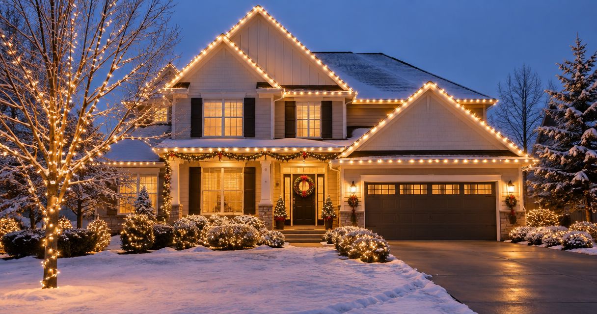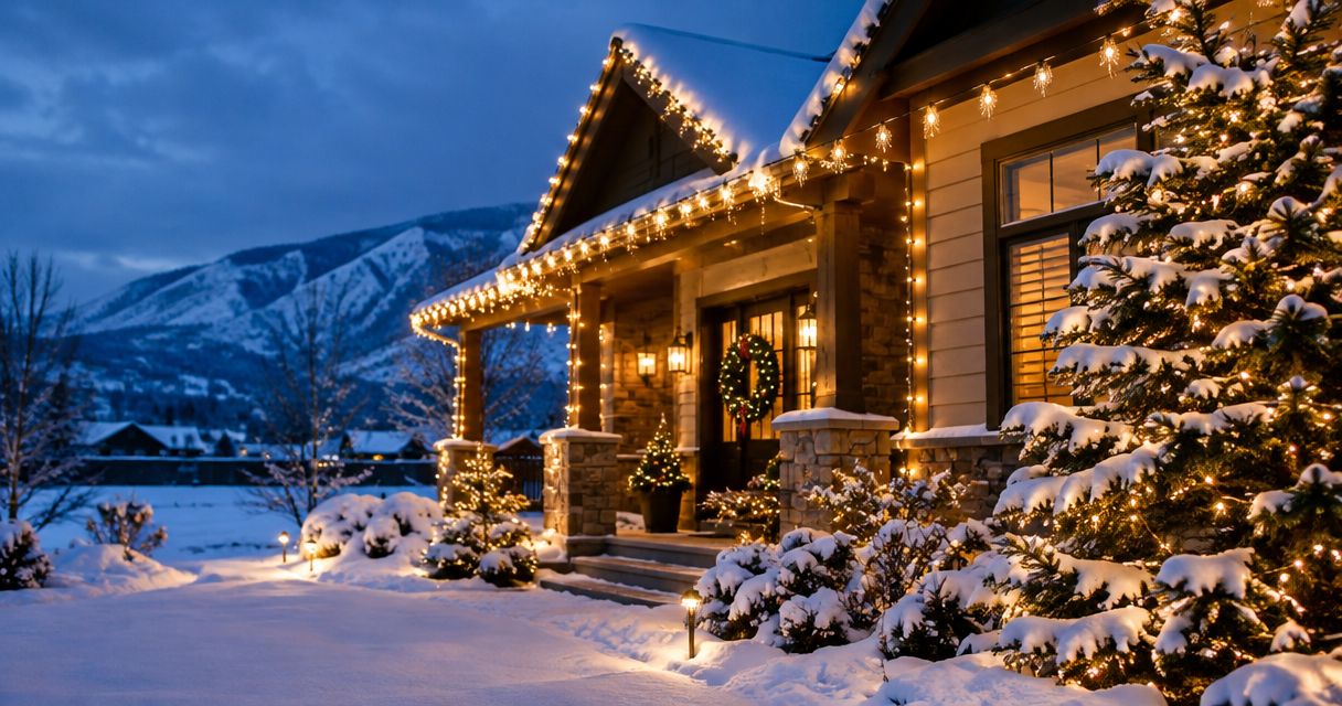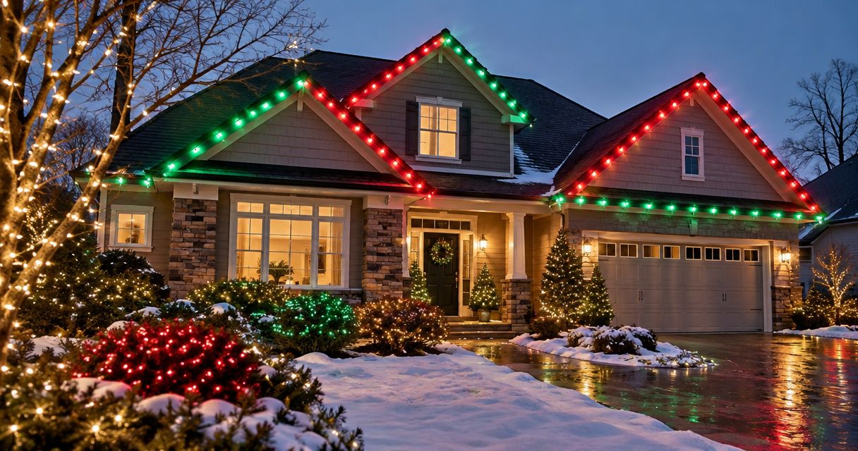
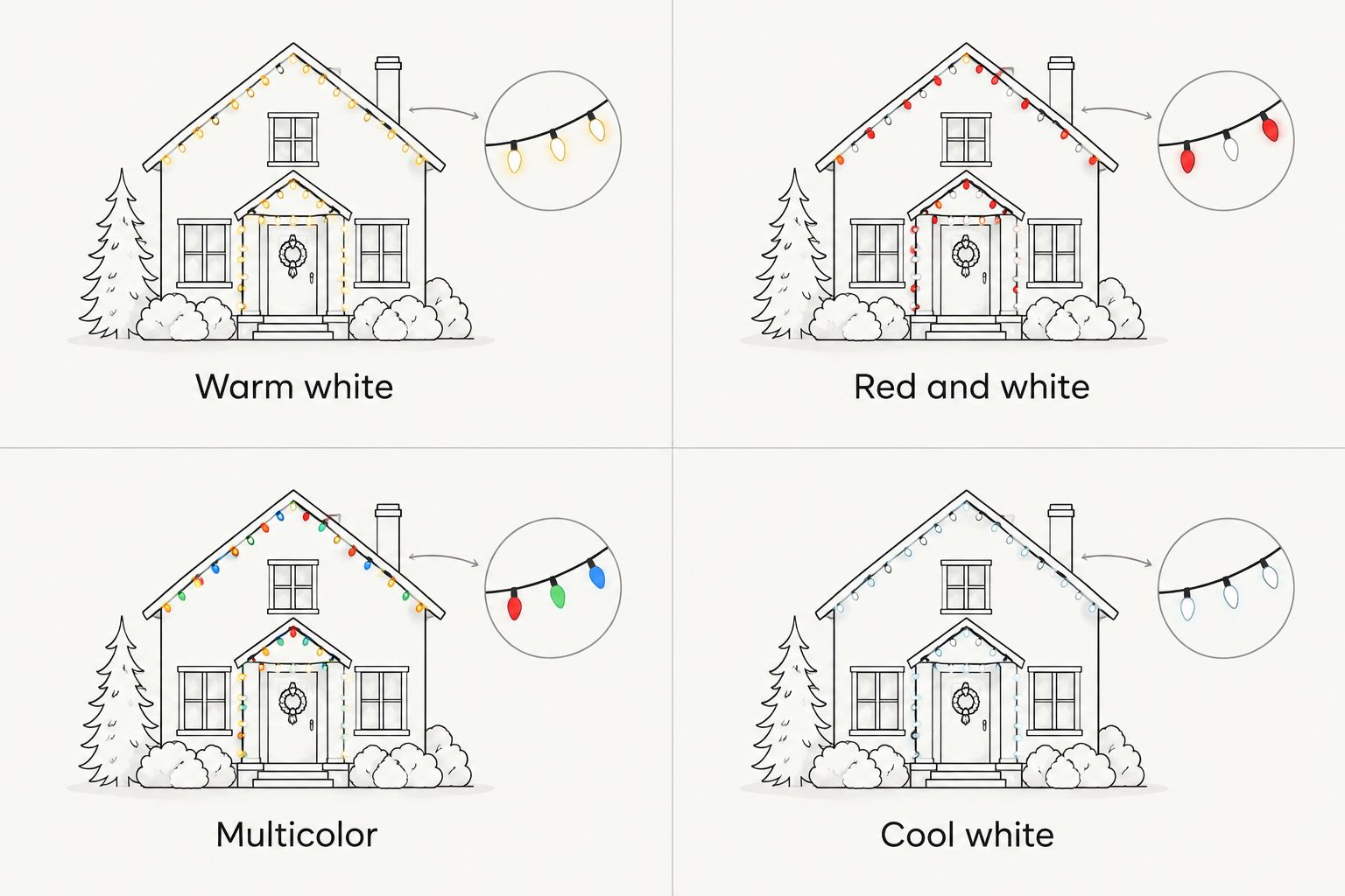
Best overall: warm white. Best for a traditional holiday entrance: red and white. Best for a playful yard: multicolor. Best for a crisp winter look: cool white. These are the best Christmas light colors for curb appeal in 2026 when you choose a palette that supports your home's exterior rather than competing with it.
- Warm white is the best Christmas light color for curb appeal when you want a restrained, coordinated exterior.
- Red and white suits a traditional entrance; multicolor suits a playful yard; cool white suits a crisp winter display.
- Choose one dominant palette, then repeat it across the roofline, entrance, and selected landscape features.
- SOK Lighting suits homeowners who want custom Christmas light design, installation, maintenance, takedown, and storage.
Why this matters
Christmas lights frame the house after dark. A clear color plan helps the roofline, front door, and landscaping read as one display instead of separate projects.
Start your 2026 plan with the view from the street, not a close-up of a bulb. Decide what you want people to notice first. Then choose the colors that support that focal point.
SOK Lighting is best for homeowners who want a custom Christmas light display without handling installation, seasonal maintenance, takedown, or storage. SOK Lighting provides those services for homeowners in Nampa, Meridian, Boise, and Eagle, Idaho.
The color decision still comes first. A full-service installation should reflect your house and your preferences, not force every exterior into the same palette.
What makes the best Christmas light colors for curb appeal?
Use these criteria to choose a palette before deciding where every strand goes:
- Exterior compatibility: Look at the lights against your siding, brick, stone, trim, and front door. Choose a combination you like together after dark.
- A clear focal point: Give the entrance, roofline, or a landscape feature priority. Do not ask every surface to command equal attention.
- Color consistency: Repeat the chosen palette across connected features. Avoid accidentally mixing different-looking whites along one continuous roofline.
- Street-level readability: Judge the whole display from the sidewalk or street. A detail that looks appealing at arm's length can disappear in the larger composition.
- Personal fit: Choose restrained, traditional, playful, or wintry on purpose. Curb appeal should still look like your home.
For a straightforward starting plan, use 2 colors at most, 1 focal point, and 3 display zones: roofline, entrance, and landscape. This is a design constraint, not a technical requirement. A deliberate multicolor display is the exception, not a mistake.
Christmas light colors at a glance
| Rank and palette | Best for | Standout feature | Key limitation |
|---|---|---|---|
| 1. Warm white | A restrained, coordinated exterior | A single-color outline that keeps attention on the house | Limited color contrast without an accent |
| 2. Red and white | A traditional holiday entrance | A clearly defined two-color holiday pattern | Competing patterns can make the display feel busy |
| 3. Multicolor | A playful yard and family-focused display | Color variety becomes the main decorative feature | Needs consistent repetition to avoid a scattered effect |
| 4. Cool white | A crisp winter look | A deliberately cooler alternative to warm white | Can conflict visually with nearby warm-white lighting |
The ranking favors a clear exterior composition over the largest number of colors. Warm white is the default recommendation for 2026; the other palettes win when you want their specific effect.
1. Warm white: best for a restrained exterior
Warm white uses one color family to define the house. Put it along a roofline, around an entrance, or on a selected tree without making color contrast the main event.
Choose warm white when you want the architecture to lead. It is the strongest default for an undecided homeowner because the plan can stay simple: repeat one white tone and let placement create the shape.
Warm white pros:
- Keeps a continuous roofline visually consistent.
- Leaves room for wreaths, greenery, or existing door decorations.
- Supports a restrained display without needing an alternating pattern.
- Gives you a clear reference when coordinating separate lighting zones.
Warm white cons:
- Offers little color contrast on its own.
- Different-looking warm-white strands can interrupt an otherwise consistent outline.
- A single-color plan still needs selective placement; covering everything removes the hierarchy.
Best for: Homeowners who want an understated Christmas display that frames the house.
For your 2026 layout, start with the roofline and entrance. Add landscape lighting only where it contributes a distinct shape, rather than repeating the same visual weight everywhere.
Buy: choose warm white if you want the simplest default palette and prefer architecture over color variety.
2. Red and white: best for a traditional holiday entrance
Red and white gives you a defined holiday palette without using every color. Use the combination to emphasize the front door, porch, or another clearly bounded feature.
Choose one pattern and repeat it. Alternating colors on the roofline, separate color blocks on shrubs, and a different pattern around the door can compete instead of connecting.
Red and white pros:
- Creates a clear two-color theme.
- Gives the entrance a distinct identity within the display.
- Works as a limited accent when you do not want a fully multicolor house.
- Makes intentional repetition easy to describe in a design brief.
Red and white cons:
- Multiple alternating patterns can crowd the composition.
- Red accents elsewhere in the yard can lose emphasis if every feature uses equal amounts of red.
Best for: Homeowners who want a recognizable Christmas palette centered on the entrance.
A practical approach is white on the main outline with red concentrated near the door. If you prefer alternating red and white across the roofline, keep the surrounding decorations simpler so that pattern remains the main feature.
Buy: choose red and white when a traditional holiday entrance matters more than a neutral exterior outline.
3. Multicolor: best for a playful yard
Multicolor makes color variety part of the display's purpose. Choose it when you want a cheerful yard rather than a restrained architectural outline.
The key is repetition, not restraint for its own sake. Carry the same color mix across selected features instead of giving every shrub, window, and roof section an unrelated treatment.
Multicolor pros:
- Makes a playful aesthetic the clear design choice.
- Gives colorful ornaments and yard decorations a matching context.
- Allows the landscape to become a feature rather than just a backdrop.
- Avoids forcing a color-loving household into an all-white scheme.
Multicolor cons:
- Different color mixes can make connected areas look unrelated.
- Detailed patterns are harder to read when too many nearby features compete.
- Color variety can distract from architectural details you wanted to highlight.
Best for: Homeowners who want a colorful yard and prefer visible holiday character over a quiet outline.
For 2026, choose where multicolor belongs before adding it everywhere. A multicolor tree with a simpler house outline creates a different result from a fully multicolor roofline and yard. Either is a valid choice; mixing the two approaches without a plan is the problem.
Buy: choose multicolor when color itself is the attraction, and repeat the same mix deliberately.
4. Cool white: best for a crisp winter look
Cool white creates a different mood from warm white. Use it when you specifically want a cooler-looking display rather than choosing it as an interchangeable substitute.
Look at your existing porch and landscape lights before committing. If those remain visibly warm, decide whether you like the contrast or want a more consistent appearance.
Cool white pros:
- Establishes a distinct winter-focused palette.
- Creates a clear alternative to traditional warm-white lighting.
- Supports a single-color display with no alternating pattern to manage.
Cool white cons:
- Warm and cool whites placed together can look unintentionally mismatched.
- The cooler appearance will not suit homeowners seeking a warm, soft-looking entrance.
Best for: Homeowners who deliberately prefer a crisp winter appearance.
Keep the choice consistent along connected features. If the roofline is cool white, review nearby entrance lighting from the street before adding another white tone.
Buy: choose cool white for its specific appearance, not because all white lights seem interchangeable.
How we ranked these color palettes
This ranking uses exterior compatibility, focal-point clarity, color consistency, street-level readability, and personal fit. It is a design recommendation, not a measured claim that one palette increases property value or wins a homeowner survey.
Warm white ranks first as the simplest default. Red and white, multicolor, and cool white each serve a different preference rather than competing for the same job.
For SOK Lighting Christmas light designs, the useful question is not which color wins universally. It is which palette gives your particular exterior a clear, intentional appearance.
Turn your palette into an installation brief
Before you discuss a 2026 installation, write down the decisions that matter. A short brief is more useful than a collection of unrelated inspiration photos.
- Main palette: Name warm white, red and white, multicolor, or cool white.
- Focal point: Identify the entrance, roofline, or landscape feature that should lead.
- Display zones: Describe what belongs on the house and what belongs in the yard.
- Existing lighting: Note porch and landscape lights that will remain visible.
- Seasonal handling: Confirm who handles maintenance, removal, and storage.
SOK Lighting designs, installs, maintains, takes down, and stores custom Christmas light displays. That addresses the seasonal work, while your brief gives the design a clear direction.
Color selection does not replace an installation plan. Keep the conversation about both the finished appearance and the work needed after the lights first turn on.
Plan your Christmas light display
Choose a custom display with design, installation, maintenance, takedown, and storage.
Which Christmas light colors should you choose?
Choose warm white if you are undecided. It gives you a straightforward starting point without requiring a color pattern across every feature.
Choose red and white for a traditional entrance, multicolor for a playful yard, or cool white for a deliberate winter look. Keep the reason for your choice clear, then repeat that choice across the display.
Do not add another color just because an unused strand is sitting in the garage. A smaller, coordinated plan is the recommendation here—not a requirement to decorate every available surface.
FAQ
What are the best Christmas light colors for curb appeal?
Warm white is the best default Christmas light color for curb appeal in this guide. Choose red and white for a traditional entrance, multicolor for a playful yard, or cool white for a crisp winter look.
Is warm white better than cool white for Christmas lights?
Warm white is the better choice when you want a warm-looking, restrained exterior; cool white is better when you specifically want a cooler winter appearance. Compare either choice with the porch and landscape lights that will remain visible.
Do multicolor Christmas lights look good on a house?
Multicolor Christmas lights work when a playful, colorful display is the goal. Repeat the same color mix across selected features instead of giving every part of the property a different treatment.
How many Christmas light colors should I use outside?
Start with no more than two colors for a straightforward exterior plan. A deliberate multicolor display is an alternative; the important decision is repeating the palette consistently rather than adding unrelated combinations.
Can I mix warm-white and cool-white Christmas lights?
Mix warm-white and cool-white lights only when you want the contrast. For a continuous roofline, choose a consistent white tone so connected sections do not look accidentally mismatched.
Should my roofline and tree lights match?
Match the palette when you want the house and landscape to read as one coordinated display. If the tree is the colorful focal point, keep the house simpler rather than making both compete equally.
Does SOK Lighting take down and store Christmas lights?
SOK Lighting takes down and stores custom Christmas light displays, in addition to designing, installing, and maintaining them. The service is for homeowners in Nampa, Meridian, Boise, and Eagle, Idaho.
One last thing
Check the display with your porch light on. That light is part of what people see, even though it is not a Christmas decoration.
Before approving your 2026 palette, view the entrance and roofline together from the street. Choose the combination that works in the full view, not just the strand that looks best up close.